Hunger Plates,
tangibilities of data
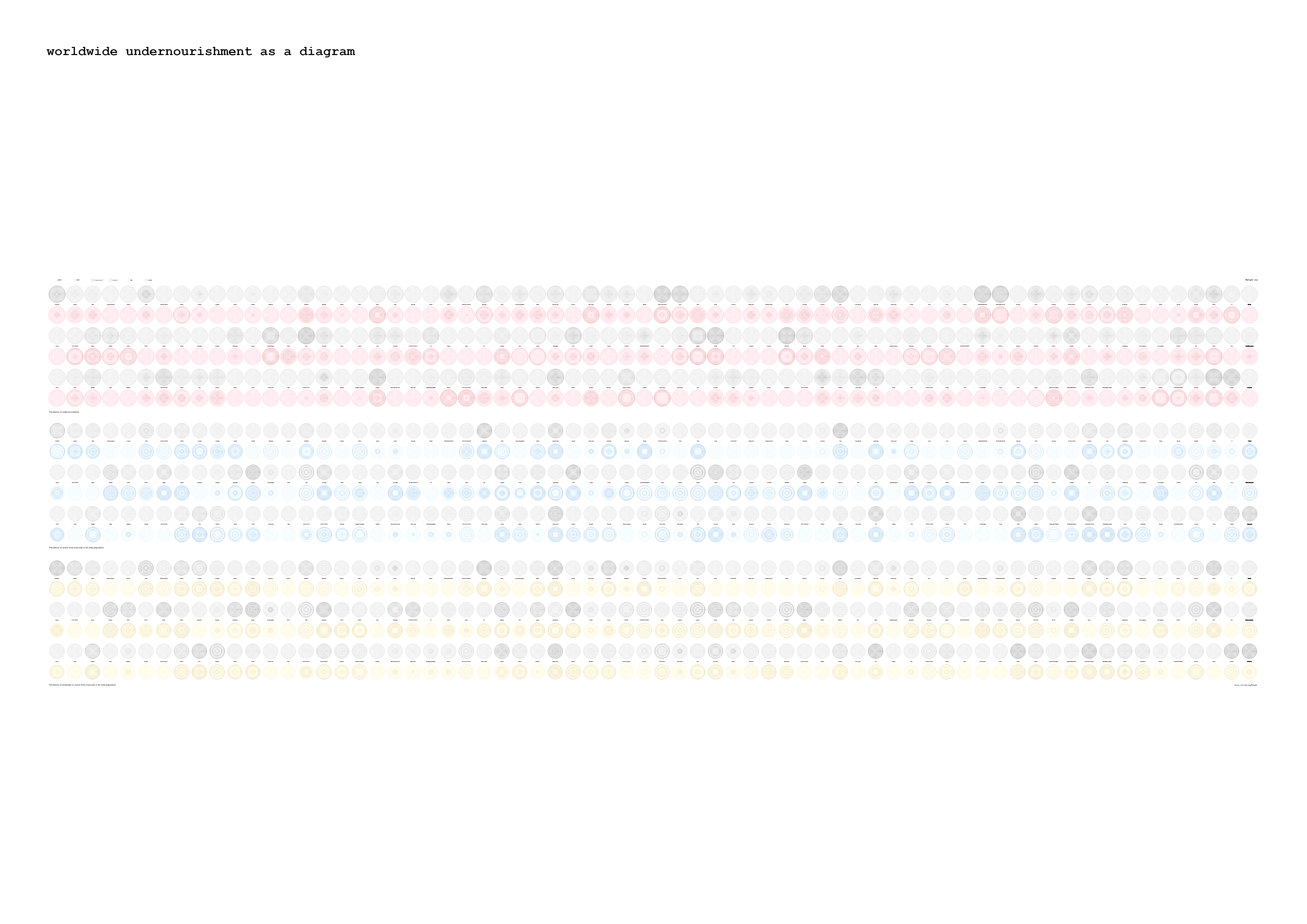
This project is working with data on worldwide undernourishment from the year 2000 to 2020, reshaping and giving it a new form.
The abstract representation as numbers in rows and columns makes their actual meaning feel distant and less tangible.
This distance should be overcome by giving the data a representation that highlights its meaning for the individuals it stands for.
The shape of a plate was chosen for the comparison of data but also to ease the viewer‘s perception and give a familiar object within this context.
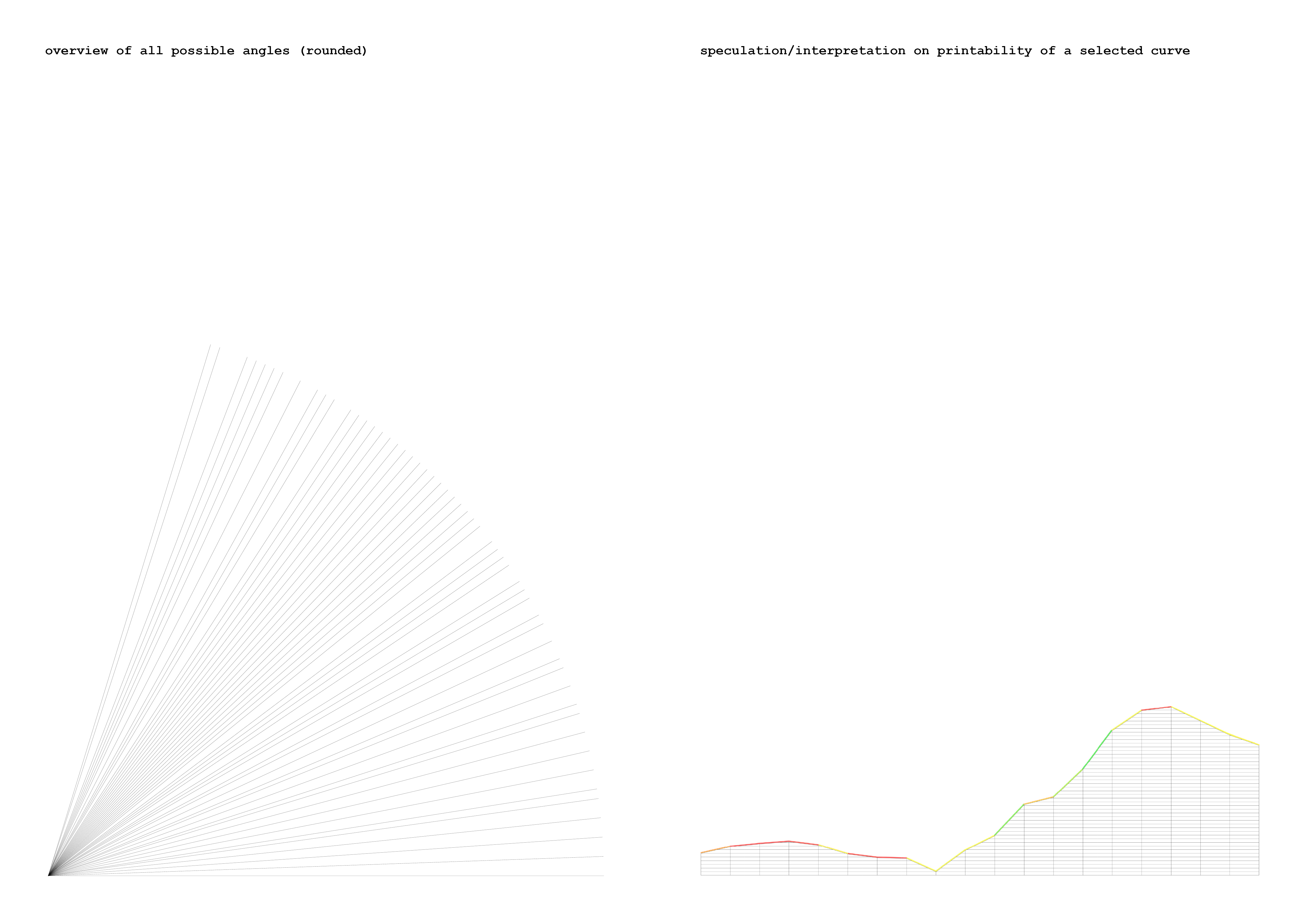
These plates were 3d printed in clay using a support structure that was parametrically created on each graph,
representing a county’s undernourishment.
This structure is meant to be separated after firing the clay since its primarily used while printing, drying, and firing.
In this case, it gives height information to compare the severeness of undernourishment between countries.
To download as PDF click here